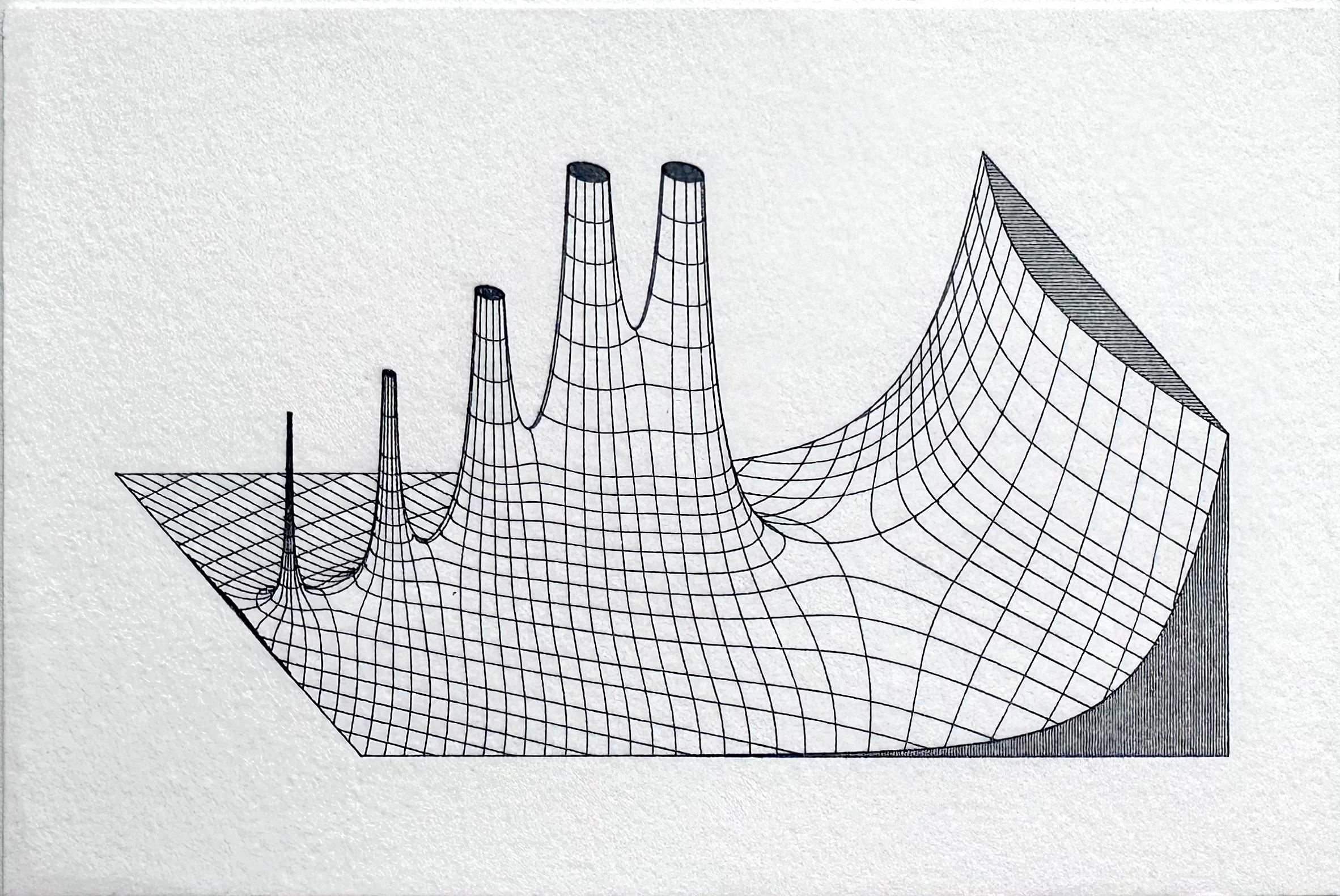
Recreating vintage Jahnke and Emde mathematical illustrations with NumPy and SciPy
Several years ago I purchased an XY plotter, a device similar to a CNC machine that would allow me to accurately plot directly from SVG files with nothing more than a pen and paper. I began making plots based on series of ordinary differential equations, before branching out to 3D contour plots generated from USGS elevation data. In doing so, I developed a novel algorithm that used depth buffering to compute contour occlusion in 3D contour plots. After encountering an image of a plot of the complex gamma function in Jahnke and Emde’s Tables of Functions With Formulas and Curves (1933), I realized I could adapt my point occlusion algorithm to recreate these figures.
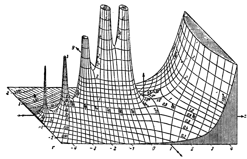
A quick search of the web revealed that I was far from the first person to recreate these plots. However, I noticed that most attempts suffered from several common problems. Firstly, they lacked resolution. Although the original plots were developed well before modern digital computers and relied solely on hand computation, they contain a wealth of intricate detail that makes them difficult to reproduce. My initial experiments confirmed this problem: even at relatively high sample resolution, many artifacts were visibly present, particularly near singularities and other discontinuities. It turns out that generating high-quality 3D contour plots is computationally expensive, and most graphing libraries yield subpar results. Worse yet, 3D plotting libraries are ill equipped for reproducing effects like line shading on cutaways.
The solution was clear: roll my own. By this point I was quite comfortable with creating high resolution plots in two dimensions, and I had plenty of experience working with 3D data. How hard could it be? Quite hard, it turned out.
The first step was simply to generate a dataset of sufficient resolution. As I eventually discovered, this could mean file sizes of upwards of a gigabyte. This turned out to be near the upper limit of what my personal computer could handle in terms of memory requirements, since I also had to store large datasets of sampled contours, index values, simplex representations, and depth buffers. More than once I encountered a kernel panic when my system ran out of swap space!
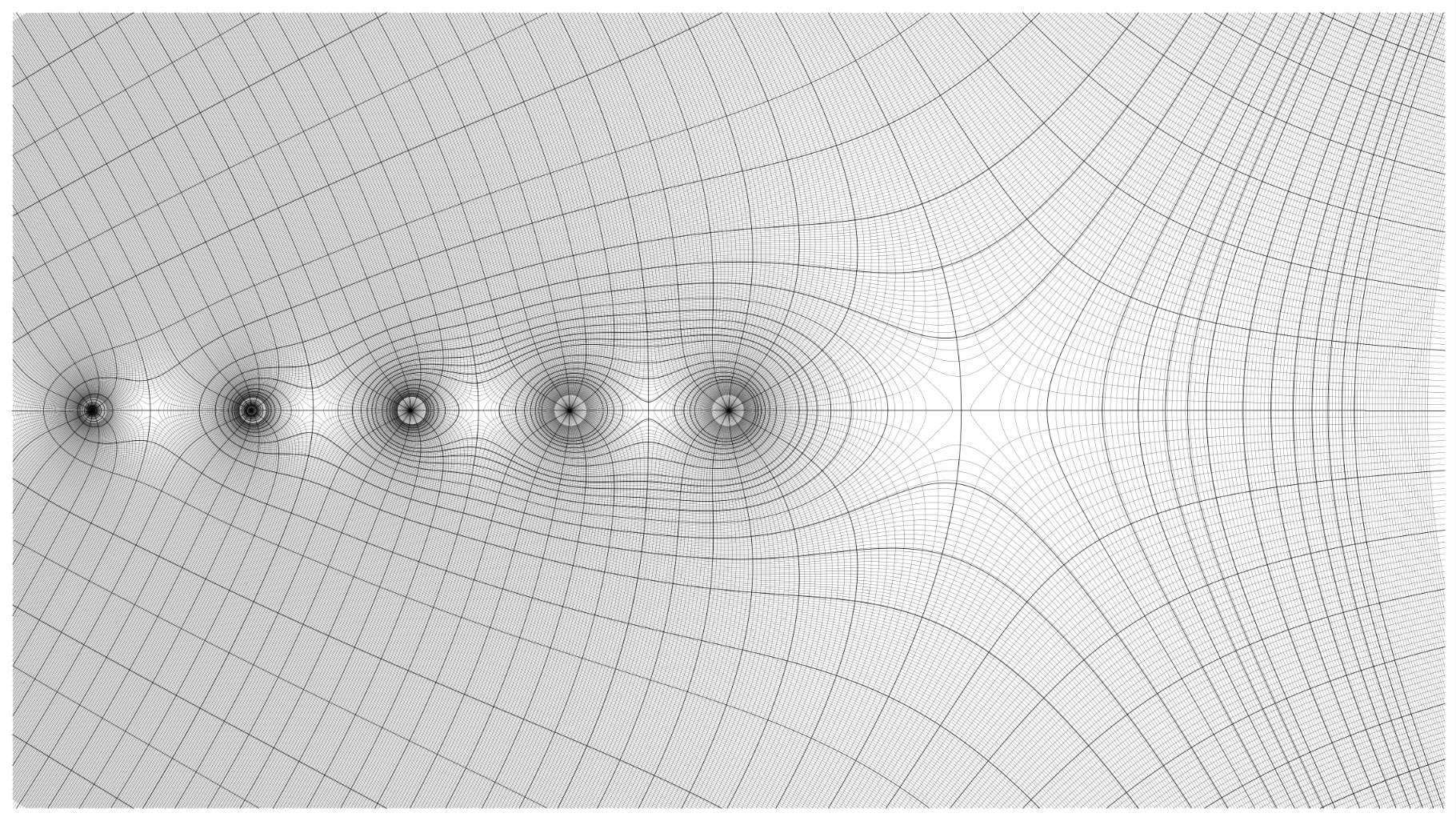
After generating sample data, I used matplotlib’s contour function to find two-dimensional contours for both phase angle and magnitude. Although parts of the API are now deprecated, I found it to be more efficient for computing large contour sets than the comparable methods available in the scikit-image library. I further subdivided the contours into major and minor sets. The minor contours are spaced at tighter intervals than the major sets, and come into play later when computing depth buffer values. I attempted to reproduce the exact contour intervals used in the original graph, which were often irregular with nonlinear spacing.
After finding contours, the next step was to eliminate sections of contours in areas where the graph contained a cutaway, as well as truncating height values at the appropriate levels. This involved careful tabulation of contour index values, since it often required splitting contours into multiple parts. Finally, where there were discontinuities or singularities in graphs, it was often necessary to cull redundant or overlapping contours to preserve visual appearances. Finally, I also generated boundary lines and line shading. These are relatively simple – straight lines can be specified by their endpoints, while curves are generated by evaluating the function along a specified interval.

At this stage, each datapoint is fully specified by its position in 3D space, with the x and y dimensions corresponding to the imaginary and real components respectively, and the z dimension corresponding to the magnitude of the function evaluated at that point. Since the original plots used isometric perspective, the projection algorithm is relatively simple. An isometric shear transformation is applied, followed by a series of rotations to orient the data before projecting down to two dimensions.
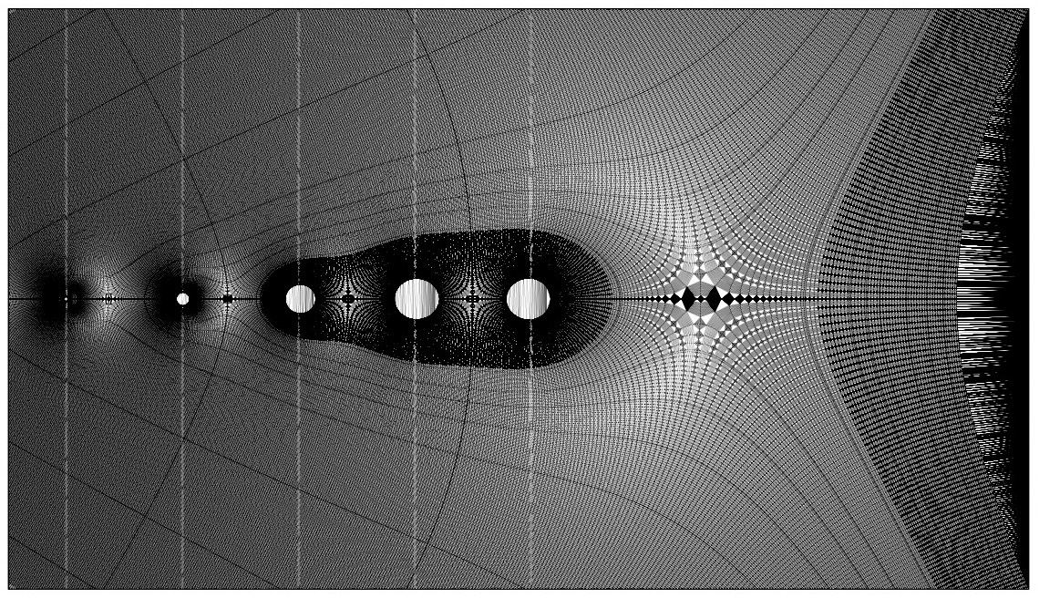
In order to facilitate depth buffering, I next used a Delaunay triangulation algorithm to compute a mesh from the contour points. The additional resolution introduced by the minor intervals results in simplexes with shorter edges, yielding a more accurate depth buffer. For each simplex, any overlapping points in the depth buffer are compared and overwritten if necessary. This is the most time-consuming portion of the algorithm, often requiring runtimes measured in hours, not minutes. As the primary bottleneck, this would be a prime candidate for optimization, especially given the highly parallel nature of the task, which should translate naturally to GPU shaders. However, based on my initial research it seemed highly non-trivial to adapt my pipeline to incorporate an off-the-shelf depth buffering algorithm from a framework like OpenGL.
Once the depth buffer was computed, I also had to account for all surfaces lying orthogonal to the imaginary plane, since including these in the original Delaunay triangulation would result in degenerate simplexes. The proper approach would be to compute separate triangulations for each orthogonal surface, but an easier approach is to iterate through points along the bounding curves, locate the corresponding points in the depth buffer, and overwrite their values with an arbitrarily large value. Any orthogonal surfaces can then be rendered directly without reference to the depth buffer, since no portion of them is occluded by other points.
Finally, I noticed one feature that wasn’t immediately apparent to me: each of the original graphs contained curves that didn’t correspond to any contour values. These lines were outlines corresponding to the silhouettes of many of the surfaces. After some thought I realized I could use the depth buffer to extract this information by thresholding the buffer data. After some fine-tuning of threshold values, I applied a contour-finding algorithm, truncating the results to obtain a set of outlines. Surprisingly, this was one of the fastest but most memory-intensive steps of the algorithm, since it involves copying a large data buffer.

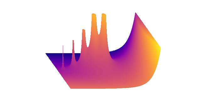
The last step is simply to plot the contours with reference to the depth buffer. All contiguous line segments can be plotted together. Bounding boxes, shading, and outlines can be rendered independently. I simply used matplotlib’s two-dimensional plot method to do all the rendering, outputting the resulting file to SVG. The final renderings contain hundreds of thousands of data points, with SVG sizes under 5MB, well within the limits of my XY plotter. The final prints take about 10 minutes to plot at postcard size. Although there are some slight idiosyncrasies, the resolution obtained is impressive, and I’m very happy with the final results.
The Jupyter notebook for this project can be found here.